Color is more than just a visual experience—it’s a psychological tool that influences perception, behavior, and decision-making. In the world of branding, color is one of the most powerful elements to evoke emotion, communicate values, and establish identity. From the calming blues of tech companies to the energizing reds of fast-food chains, color choices are never random. They’re strategic.
In this article, we explore the psychology behind color in branding, how businesses leverage it to connect with consumers, and what you should consider when selecting a color palette for your own brand.
Why Color Matters in Branding
Color is often the first element a person notices about a brand. In fact, research suggests that up to 90% of initial judgments about a product can be based solely on color. The right color not only helps brands stand out but also enhances brand recognition by up to 80%.
Consider these examples:
- Coca-Cola uses red to stimulate appetite and excitement.
- Facebook uses blue to convey trust and stability.
- Starbucks uses green to evoke feelings of calm, growth, and connection with nature.
Each choice reinforces a psychological response, helping brands craft an identity that resonates emotionally with their audience.
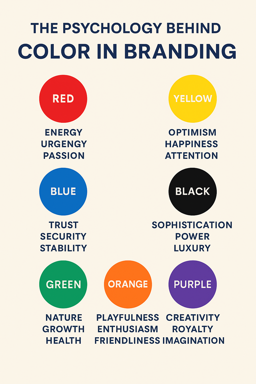
The Psychology of Popular Brand Colors
Let’s break down what different colors typically communicate:
- Red: Energy, urgency, passion, appetite
Best for: Food, entertainment, sports, clearance sales - Blue: Trust, security, stability, calm
Best for: Finance, tech, healthcare - Green: Nature, growth, balance, health
Best for: Wellness, environmental, organic, sustainability brands - Yellow: Optimism, happiness, attention-grabbing
Best for: Children’s products, retail, food - Black: Sophistication, power, luxury
Best for: Fashion, luxury, tech - Purple: Creativity, royalty, imagination
Best for: Beauty, spirituality, luxury - Orange: Playfulness, enthusiasm, friendliness
Best for: Startups, youth brands, travel - Pink: Compassion, femininity, softness
Best for: Beauty, fashion, children’s products
Choosing the Right Colors for Your Brand
Choosing a brand color should go beyond personal preference. Ask yourself:
- Who is my target audience?
Different demographics respond to colors in unique ways. - What emotions do I want to evoke?
Should your brand feel bold and adventurous or calm and trustworthy? - What’s my industry standard?
While it’s okay to be different, understanding color trends in your sector can help or hurt recognition. - How does the color perform across platforms?
A great brand color should look good on digital, print, and physical products.
The Role of Color Consistency in Brand Recognition
It’s not enough to just pick a great color—you must use it consistently. A cohesive color scheme:
- Builds trust and familiarity
- Helps consumers recall your brand
- Unifies all your marketing materials and customer touchpoints
Brands like Tiffany & Co. (with their iconic teal) and McDonald’s (with their golden arches) demonstrate how color can become synonymous with the brand itself.
Mistakes to Avoid
- Following trends blindly: Just because a color is “in” doesn’t mean it’s right for your brand.
- Using too many colors: A cluttered palette can dilute your message.
- Ignoring accessibility: Make sure your colors are readable for all users, including those with visual impairments.
Final Thoughts
Color in branding is both an art and a science. When used effectively, it can help tell your story, build emotional connections, and even influence consumer behavior. As your brand evolves, your color palette should remain a powerful anchor for recognition and trust.
FAQs
1. How many colors should my brand use?
Ideally, your brand should have 1–2 primary colors and 2–3 secondary colors. This ensures variety without overwhelming your audience.
2. Can I change my brand colors later?
Yes, but with caution. A color rebrand requires a thoughtful rollout plan to maintain recognition and consumer trust.
3. What is color psychology in marketing?
It’s the study of how colors affect perceptions and behaviors. Marketers use it to influence emotions and actions.
4. Do colors mean the same thing across cultures?
Not always. For example, white signifies purity in Western cultures but mourning in some Eastern traditions. Always research your audience.
5. Are there tools to help me choose brand colors?
Yes! Tools like Adobe Color, Coolors, and Canva’s Brand Kit can help you experiment with palettes that reflect your brand’s personality.
Ideally, your brand should have 1–2 primary colors and 2–3 secondary colors. This ensures variety without overwhelming your audience.
Yes, but with caution. A color rebrand requires a thoughtful rollout plan to maintain recognition and consumer trust.
It’s the study of how colors affect perceptions and behaviors. Marketers use it to influence emotions and actions.
Not always. For example, white signifies purity in Western cultures but mourning in some Eastern traditions. Always research your audience.
Yes! Tools like Adobe Color, Coolors, and Canva’s Brand Kit can help you experiment with palettes that reflect your brand’s personality.