logo design

The Evolution of Logo Design: Then vs Now

The Evolution of Logo Design: Then vs Now

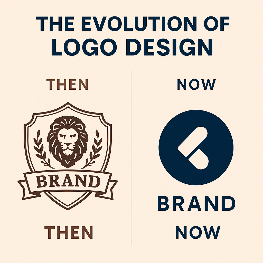
From ornate coats of arms to minimalist digital icons, the evolution of logo design is a fascinating journey through branding history, art trends, and cultural shifts. Logos are more than just symbols — they’re identity anchors for businesses, emotions wrapped in design. In this article, we explore how logos have changed over the decades, why they’ve changed, and what that means for brands today. Then: Detailed, Literal, and Traditional 1. Early Logos Were Literal In the early to mid-1900s, logos were often realistic and illustrative. Think of early car brands, breweries, or banks — their logos typically used crests, heraldic symbols, or full depictions of products. Example: The original Starbucks logo (1971) featured a detailed, twin-tailed mermaid in brown tones, inspired by 16th-century woodcuts. 2. Typography Was Decorative Fonts used in old logos were highly stylized — script, serif, and heavily ornamental. These designs conveyed tradition, craftsmanship, and authenticity. 3. Color Palettes Were Limited Due to printing technology limitations, color choices were often subdued, and most logos were black-and-white until color printing became standard. 4. Function Over Versatility Old logos were built for signage, product packaging, and print. Scalability and digital adaptability weren’t priorities. Now: Minimal, Abstract, and Digital-First 1. Simplicity Rules Today’s logos are clean, flat, and minimalist. Think Apple, Nike, or Airbnb. The emphasis is on quick recognition and digital scalability. Consumers scroll fast. Logos need to register instantly on screens of all sizes. 2. Abstract Over Literal Modern logos often imply meaning rather than state it directly. Logos like Twitter’s bird or Slack’s symbol evoke emotion and connection without needing text. 3. Bold Typography Contemporary font trends favor bold sans-serif typefaces, all-caps, and custom lettering — creating strong, modern identities. 4. Flexible Design Systems Modern logos are part of a larger brand system — adaptive for app icons, website headers, social media profiles, and merchandise. Think responsive logos that morph by screen size. Why the Shift? The Hybrid Future: Best of Both Worlds? Some brands are embracing both past and present. Retro-modern logos — where nostalgic design is updated with sleek geometry — are trending. Example: Burger King’s 2021 rebrand resurrected its vintage logo with flatter, simplified execution for modern platforms. FAQs 1. Why are modern logos so minimal?Minimalism ensures versatility, readability, and fast recognition across digital devices and platforms. 2. Do detailed logos still work?In some industries — like luxury fashion or wine — ornate or detailed logos still convey heritage and prestige. But even they often simplify for digital. 3. Should my logo evolve over time?Yes. Refreshing a logo every few years keeps your brand current and ensures it fits changing mediums and audience preferences. 4. What’s a responsive logo?A responsive logo adapts based on screen size or usage. For example, a full logo on desktop may reduce to just the icon or monogram on mobile. 5. How often should companies rebrand?There’s no strict rule, but if your logo feels outdated or no longer aligns with your brand vision or audience, it may be time for an update — typically every 7–10 years. Final Thoughts The evolution of logo design is a testament to how brands respond to the world around them. As society changes, so does visual identity. Whether you’re a startup creating a new logo or an established brand considering a redesign, understanding past and present trends can help you build a logo that resonates today — and lasts tomorrow.

Read more
5 Logo Mistakes That Hurt Your Brand

5 Logo Mistakes That Hurt Your Brand

A logo is more than just a pretty graphic—it’s the face of your brand. It’s often the first thing people associate with your company, which is why getting it right is non-negotiable. However, even well-meaning businesses make critical logo mistakes that can diminish brand credibility, hinder recognition, and impact conversions. In this article, we’ll highlight five common logo design mistakes that can hurt your brand—and how to avoid them. 1. Following Design Trends Blindly Design trends can be tempting to follow, especially when everyone is doing it. But what’s trendy today might be outdated tomorrow. Logos should be timeless, not trendy. Avoid it by: Focusing on your brand’s core values and voice rather than short-term design fads. Strive for originality. 2. Overcomplicating the Logo A logo that’s too detailed or intricate loses its effectiveness when scaled down or printed in black and white. Simplicity ensures that your logo remains clear and recognizable across all platforms. Avoid it by: Choosing clean lines, minimal shapes, and avoiding unnecessary embellishments. 3. Choosing the Wrong Font Typography sets the tone for your brand. A mismatched font can send the wrong message—Comic Sans for a law firm, anyone? Avoid it by: Using legible, professional typefaces that align with your brand’s tone and target audience. 4. Using Generic or Stock Icons A logo should reflect the uniqueness of your brand. Using clip art or stock icons can make your logo look cheap and unoriginal. Avoid it by: Hiring a professional designer to create a custom design that speaks specifically to your brand. 5. Ignoring Versatility Your logo needs to work across various formats—from social media profiles to billboards. A logo that doesn’t scale well or lacks flexibility in color variations is a big problem. Avoid it by: Designing in vector format and testing your logo in different sizes and color settings. FAQs Q1: Why is my logo not resonating with customers?A1: It could be due to complexity, irrelevant fonts, or poor design alignment with your brand identity. Q2: Can I fix an existing logo or should I start from scratch?A2: A brand refresh is often enough if the logo has recognition value. Otherwise, a redesign might be necessary. Q3: Should I use online logo generators?A3: While they’re cost-effective, they often result in generic designs. A custom logo better represents your brand. Q4: How do I choose the right color for my logo?A4: Colors should reflect your brand’s personality and resonate with your target audience emotionally. Q5: What’s the best file format for a logo?A5: Vector files (like SVG or AI) are ideal as they maintain quality at any size and are easy to modify. Conclusion Your logo speaks volumes about your brand. Avoiding these five common mistakes can elevate your visual identity and set a strong foundation for consistent branding. Think of your logo not just as a design, but as a strategic asset.

Read more
How to Design a Logo That Captures Your Brand Identity

How to Design a Logo That Captures Your Brand Identity

A logo is more than just a pretty icon—it’s the visual cornerstone of your brand. When done right, it distills your company’s values, mission, and personality into a mark that communicates your identity in an instant. In an era where consumers make snap judgments, your logo is your first (and sometimes only) chance to leave a lasting impression. So, how do you design a logo that truly encapsulates your brand identity? Here’s a step-by-step breakdown rooted in strategy, creativity, and timeless design principles. 1. Understand Your Brand’s Core Before jumping into sketches and software, reflect on what your brand represents. Ask yourself: Your answers will shape the visual language of your logo. 2. Study the Competitive Landscape Look at the logos of your competitors—not to copy them, but to learn what works (and what doesn’t) in your industry. Identify gaps where your brand can visually differentiate itself. The goal is to stand out, not blend in. 3. Choose the Right Logo Type There are several types of logos to consider: Choose based on your brand’s personality and scalability needs. 4. Select Colors with Meaning Color psychology plays a huge role in branding. Blue communicates trust and professionalism, red evokes passion and urgency, green signals growth and nature. Select a palette that reflects your brand’s message and resonates with your audience. 5. Focus on Simplicity and Versatility The most iconic logos are simple and versatile. They work in black and white, are legible at any size, and look great across mediums—web, print, merchandise, and social media. Avoid trends that might date your logo quickly. Aim for timelessness. 6. Typography Matters If your logo includes text, choose typography that aligns with your brand tone. A tech company might lean into sleek, sans-serif fonts, while a luxury brand may favor elegant serifs. Make sure it’s legible at all sizes. 7. Test Before Finalizing Once you have a draft, test your logo in various contexts: Feedback from your target audience is invaluable here. 8. Document It in Your Brand Book Once finalized, include your logo’s usage rules in a brand book. Define acceptable spacing, color versions, backgrounds, and don’ts to maintain consistency across all brand touchpoints. 5 Frequently Asked Questions Q1: What makes a good logo design?A great logo is simple, memorable, versatile, relevant to your industry, and aligned with your brand identity. Q2: How many logo variations should I have?Ideally, at least three: a full version, a simplified icon, and a monochrome version. These ensure adaptability across different platforms. Q3: Should I hire a professional or DIY my logo?If your brand budget allows, always go with a professional designer. They bring strategic thinking and ensure technical accuracy. Q4: Can I rebrand if my logo feels outdated?Absolutely. Many brands evolve their logos to stay relevant. Just ensure the redesign maintains some continuity to preserve recognition. Q5: How important is a logo compared to other branding elements?Your logo is the face of your brand, but it’s most powerful when supported by a cohesive brand voice, messaging, and visual identity. Conclusion Designing a logo that captures your brand identity is part art, part strategy. It’s not just about aesthetics—it’s about storytelling. By grounding your design choices in brand insights and timeless principles, you create a visual identity that resonates, connects, and endures.

Read more
Contact us

Full-Service Data & Email Marketing Agency

Turn your marketing communications into a sales powerhouse and increase revenue with full-service email marketing.

Email us at: info@connectdigitalventures.com

Your benefits:

What happens next?

1

We Schedule a call at your convenience 

2

We do a discovery and consulting meting 

3

We prepare a proposal 

Request a Free Sample/Campaign Demo